
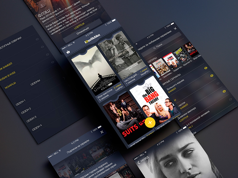
A television app may show much of the same content as a mobile or web product, but it operates in a very different environment. Viewers sit away from the screen, navigate with remote-controlled buttons, and need content with minimal effort.
These conditions shape how product decisions are undertaken. An interface that feels clear may appear tiring on a television. This is why one must plan beforehand to fulfill such customer demands.
Here’s how you can configure your playback controls the right way and improve overall user experience.
Mobile and web interfaces allow users to tap or click almost any visible element directly. Television viewers usually move through the interface one item at a time using directional buttons.
This creates a focus-based navigation model. At any moment, one element must be visibly selected. Pressing left, right, up, or down should move focus to the item the viewer expects. When that behavior is inconsistent, the interface quickly feels broken.
Problems often appear around carousels, nested menus, pop-up windows, and pages containing several content sections. A viewer may press down expecting to reach the next row, only to jump to an unrelated control. Focus can also disappear behind an overlay or return to the beginning of a page after a dialog closes.
The navigation map should be planned before screens are polished. Designers and developers need to define where focus begins, how it moves between sections, and where it returns after an action. Every screen should also offer an obvious route back.
Television interfaces cannot depend on hover effects or touchscreen feedback. The viewer needs a strong visual signal showing which element will respond when the select button is pressed.
A slight color change is rarely enough. Screen brightness, viewing distance, glare, and display settings can make subtle differences difficult to see. A focused item may need a combination of scale, border, contrast, motion, or shadow.
The effect should be noticeable without making the screen unstable. Excessive enlargement can cause neighboring items to shift or become partially hidden. Heavy animation may also make fast navigation feel sluggish.
Focus styling should remain consistent throughout the application. If a selected card grows on the home screen but receives only a thin outline elsewhere, users have to relearn the interface as they move between pages.
Entering an email address or password with a television remote is one of the least convenient parts of the experience. Each character may require several button presses, and mistakes take time to correct.
Account creation should therefore be moved to another device whenever possible. A TV app can display a short code or QR code that allows the viewer to sign in through a phone or computer. This reduces abandonment and avoids forcing users to enter complex credentials with an on-screen keyboard.
Search requires similar thought. Useful options include voice input, recent searches, suggestions after the first few characters, and browsing by category. The interface can also prioritize popular titles and common search terms so that many viewers find what they need without typing a complete query.
On-screen keyboards may still be necessary, but they should be simple, responsive, and appropriate for the target language. The app should preserve entered text if the user temporarily leaves the keyboard or opens another screen.
Rows of posters have become familiar in streaming interfaces because they fit directional navigation. Familiarity alone, however, does not guarantee usability.
Viewers need to understand what each row contains and whether more items are available beyond the visible portion of the screen. Row titles should be descriptive, while partially visible cards can indicate that horizontal scrolling is possible.
The number and order of shelves also matter. A home screen filled with loosely differentiated categories creates more work rather than more choice. High-value sections—such as Continue Watching, My List, Live Now, or Recently Added—should appear where viewers can reach them quickly.
Personalization can improve the order of content, but editorial control remains useful. New releases, seasonal collections, regional programming, and live events may need deliberate placement regardless of recommendation data.
Teams investing in smart tv app development must account for these navigation details alongside platform requirements, media playback, backend integrations, and device-specific performance.
The back button is one of the most frequently used controls in a TV application. Its behavior should never surprise the viewer.
If a user opens a title page from the fifth item in a carousel, pressing back should ideally return to that same item and scroll position. Sending the viewer to the top of the home screen forces them to repeat their previous navigation.
During playback, the back button may reveal player controls before closing the video. In a menu, it may return to the previous screen. On the application’s top-level page, it may display an exit confirmation. Whatever rules are chosen, they should be applied consistently.
Accidental exits are particularly frustrating. A viewer should not lose playback progress or leave the application because one button press was interpreted incorrectly.

TV viewers regularly pause, resume, seek, enable subtitles, or change audio tracks. These actions need to be easy to find without crowding the screen.
Playback controls should appear promptly after a remote input and disappear once viewing resumes. The current focus must be obvious, especially when several controls are arranged in a single row.
Seeking deserves special attention. Moving through a long video one second at a time is impractical, while large jumps make it difficult to find a precise moment. Progressive seeking can solve this problem by increasing the jump distance when the viewer holds down a directional button. Thumbnail previews provide additional context.
The player should also handle interruptions gracefully. If playback stops because of a temporary connection problem, the app should attempt recovery and explain what happened in plain language. Generic error codes offer little help to someone sitting across the room.
A visually attractive application can still feel unpleasant if every navigation step is followed by a pause. TV hardware varies considerably, and some widely used models have limited memory and processing capacity.
Heavy animations, oversized images, unnecessary background requests, and large application bundles can cause delayed focus movement or slow page transitions. These issues are more noticeable on television because navigation consists of repeated button presses. Even a short delay becomes irritating when it occurs after every action.
Image loading should be prioritized according to what is currently visible. Off-screen artwork can load later, while placeholders keep the layout stable. Lists should be rendered efficiently rather than loading an entire catalog at once.
Memory usage also requires attention. A long browsing session should not gradually reduce responsiveness or cause the operating system to close the app. Testing needs to include extended use, not only short demonstrations on high-end devices.
The term “smart TV” covers numerous operating systems, model years, screen resolutions, remote designs, and hardware profiles. Behavior that is reliable on one device may fail on another from the same manufacturer.
Differences can affect:
Emulators are useful during development, but they cannot fully reproduce physical hardware. A practical test device collection should represent the platforms and model years most common among the intended audience.
Analytics can help refine this collection after launch. If a significant portion of viewers uses older entry-level televisions, those devices deserve as much attention as newer flagship models.
Television accessibility involves more than adding captions. Text must remain legible from across the room, controls need adequate contrast, and important information should not rely solely on color.
Captions should be synchronized, correctly positioned, and customizable where the platform allows it. Audio descriptions and alternate audio tracks need clear labels. Screen reader support should be tested through complete journeys, including sign-in, browsing, content selection, and playback.
Motion can also create difficulties for some viewers. Automatic carousels, flashing previews, and rapidly expanding cards should be used with restraint. Where possible, users should be able to disable autoplay previews or reduce motion.
These decisions improve the experience for a broad audience, including older viewers and people watching on smaller television screens.
Design reviews often take place close to a monitor, with a mouse available to recover from navigation problems. That setup hides many of the issues viewers encounter.
A more revealing test is to install the app on a real television, sit at a typical viewing distance, and complete common tasks using only the standard remote. Can a new user find a specific title? Is the selected element always visible? How many button presses does it take to resume an unfinished program? Can subtitles be enabled without leaving playback?
This type of testing exposes small frustrations that screenshots and prototypes miss. It also shifts attention away from how the interface looks in isolation and toward how it behaves during an actual viewing session.
A good television app does not ask users to think about its navigation. It keeps focus clear, reduces typing, preserves context, and responds immediately to input. When those details are handled well, the technology recedes, and the content takes its place.
Ans: Differences can affect:
Ans: Playback controls should appear promptly after a remote input and disappear once viewing resumes. The current focus must be obvious, especially when several controls are arranged in a single row.
Ans: Heavy animations, oversized images, unnecessary background requests, and large application bundles can cause delayed focus movement or slow page transitions.
