Python’s libraries like Pandas and NumPy make it a brilliant option for data analysis.
D3.js is a unique Java toolkit that enables the construction of unique and complex presentations.
Data may originate from several sources and not always be in a format that is easily compatible in real-world situations.
The need for tools that facilitate informed decision-making is pivotal as all of the leading international industries are undergoing digitalization. This situation demands the use of data analytics and visualization technologies across many businesses.
This blog is your resource for learning about different tools if you are thinking about taking a Data Analytics Course or you are a seasoned professional looking to keep current.
This blog does not seek to explain the Differences Between Data Analytics and Visualisation; the topic is exhaustingly covered across the Internet. In this blog, we will examine what analytics and visualization are, go through a list of platforms for each discipline, and look at the challenges that exist in the industry.
Table of Contents
What are Data Analytics and Data Visualisation?
Platforms for Data Analytics
Platforms for Data Visualisation
What Does the Right Platform Mean?
Data Analytics and Visualisation Challenges
Conclusion
What are Data Analytics and Data Visualisation?
Let us take a minute to explain these two key ideas before we delve into the long number of platforms. Anyone wishing to get the most out of the tools in this blog must understand what they encompass.
Analytics is the examining, purifying, manipulating, and analysis of the information to derive actionable insights, patterns, and trends. Making info-driven decisions and resolving complicated issues requires statistical and mathematical tools. It is a broad discipline that can include everything from straightforward summaries to sophisticated predictive modelling.
Conversely, the visualization uses the graphical representation to make complicated datasets easier for consumers to grasp. With charts, graphs, and dashboards, people may see patterns and connections that are unclear from text or raw figures. Proper visual image is paramount for presenting the info in an interesting way that facilitates improved decision-making.
After defining these fundamental ideas, let us now examine the tools that enable professionals to do calculuses and produce an eye-catching presentation.
Platforms for Data Analytics
Python: Python is a flexible option for analysis thanks to packages like Pandas and NumPy. It provides a variety of statistical and data-processing tools.
SQL: The relational DBMS SQL is required to manage relational databases and run queries.
R: R is a unique statistical programming language, well-known for having a large selection of packages designed specifically for analysis.
Tableau: Tableau provides a user-friendly interface to produce interactive and shared presentations. It is popular for its drag-and-drop capabilities.
Power BI: Power BI, which Microsoft created, is another well-liked option for reporting and is renowned for its integration skills.
Excel for Microsoft: Excel is a vital tool for analysis that is sometimes underrated, especially for individuals who are more accustomed to using spreadsheets.
MATLAB: Engineers and scientists choose MATLAB for analysis, simulation, and mathematical modeling.
SAS: SAS is a complete platform utilized in many sectors, such as healthcare and finance.
Jupyter Notebooks: Using several computer languages like Python and R, Jupyter Notebooks offer an interactive environment for research.
IBM SPSS: SPSS is a dependable statistical software program for sophisticated analysis that is especially well-liked in the social sciences and research
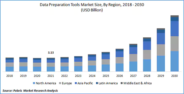
This graph shows a clear image of the Data analysis tools market size in different regions. Going further in the future, you can see how exponentially the bar is predicted to grow by 2030.
Platforms for Data Visualisation
QlikView/Qlik Sense: The Qlik tool set offers interactive and approachable solutions.
Tableau: Tableau, which was previously mentioned for calculuses, excels in and has a large selection of charts and dashboards.
D3.js: D3.js is a JavaScript toolkit that enables the construction of unique and complex presentations. It is available to anyone with coding abilities.
Power BI: It is a strong candidate in both categories because of its remarkable features.
Looker: Looker provides exploration and visual images for organizations and is now a part of Google Cloud.
Plotly: Plotly, which works with several computer languages, including Python and R, is well-known for its interactive charts.
Periscope Data: For professionals to explore, display, and share insights from their collection, there is a tool called Periscope Data.
Google Data Studio: Utilising information from numerous sources, Google Data Studio is a free application that enables the development of interactive reports and dashboards.
Sisense: Sisense provides analytical and visualization tools that both technical and non-technical people may use.
Highcharts: Highcharts is a charting package for JavaScript renowned for its aesthetically pleasing and adaptable charts.
What Does the Right Platform Mean?
After reviewing the list of platforms, let us not underestimate the significance of picking the appropriate platform for your needs. Even if there are infinite possibilities, choosing the right tools for your projects may greatly influence your productivity and the caliber of your insights. It is fault-finding to keep up with the industry’s most recent trends and technologies if you are crunching figures in Python, designing unique dashboards in Tableau, or investigating the aggregation using SQL.
Data Analytics and Visualisation Challenges
Although we have discussed a wide range of data analytics and visualization platforms, it is pivotal to recognize the difficulties that frequently accompany such potent instruments. For aspiring professionals and seasoned pros, having a solid understanding of these issues is needed.
Data Cleaning and Preprocessing: Before conducting thoughtful research or producing a perceptive visual image, you must ensure that your aggregation is clean and well-structured. Due to the possibility of mistakes, outliers, and missing numbers in the collection, this procedure can be time-consuming and requires a good eye for detail.
Data Security and Privacy: Given the growing importance placed on protection, professionals must be familiar with information security and privacy laws. Neglecting to handle sensitive info might result in moral and legal problems.
Data Integration: Data may originate from several sources and not always be in a format that is easily compatible in real-world situations. It might be challenging to combine products from many sources.
Choosing the Best Visualisations: Despite the wide range of choices available, picking the best one for your collection can take time and effort. Making the wrong decision might hide rather than reveal insights.
Performance and Scalability: Large collections of information might burden your hardware and software’s performance and scalability. A major issue is ensuring your tools can manage massive amounts of information and offer timely replies.
Data Interpretation: Producing information and visual images is one thing; effectively understanding them is quite another. Misinterpretation can lead to misguided decisions.
Communication: Lastly, explaining your results to stakeholders who are not technically proficient might be challenging. Professionals frequently need excellent communication abilities to close the communication gap between information and decision-makers.
Conclusion
Both data analytics and visualization are necessary for maximizing their potential. There is a platform out there to meet your individual needs, if you are working with statistics, making interactive dashboards, or looking through collections for insights. Maintain your proficiency, consider taking an analytics course if you are just getting started, and have an open mind regarding the constantly changing field of data analysis and visualization.