KEY TAKEAWAYS
- Strong CTAs guide visitors and boost nonprofit website engagement significantly.
- Design, color, and placement of CTAs directly affect user interaction.
- Clear, emotional language in CTAs increases donor and volunteer response.
- Segmented CTAs match different visitor needs, improving conversion chances.
According to the M+R Benchmarks Study 2023, nonprofit donors made 44% of their donations when visiting the nonprofit’s website directly.
That said, when it comes to engaging or requesting donations from donors, we can clearly see how beneficial a well-organized website is. And one of the best tools around in the engagement/asking area is the call-to-action (CTA).
In this article, I will be covering: ways to write CTAs that convert, the thinking behind the design and layout of CTAs, and what best practices nonprofit websites can use to have the largest level of impact.
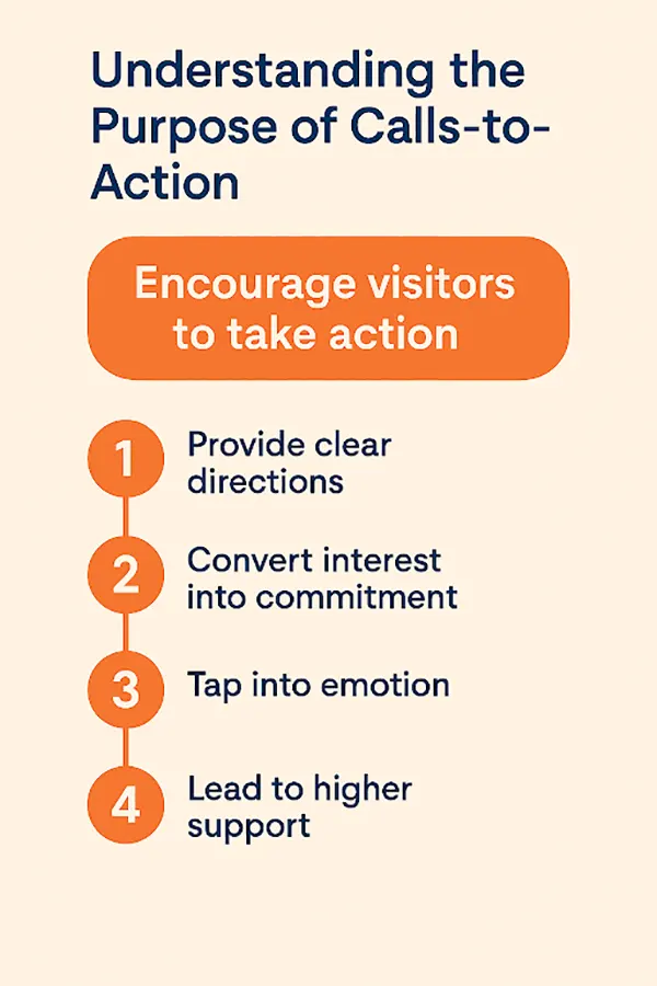
An aptly-put CTA can provide visitors with some directions, and stimulate them to proceed farther. Lack of one can make a page that may have all the information that can be presented in a beautiful manner, still leave the user ambiguous about the next step to take.
This can lead to lost opportunities for support. An evident CTA assists in converting interest into a promise, be it a payment, subscription to a newsletter, or merely a click as a way of finding out more about the cause.
It is not sufficient to ask the role of CTA. It is to inspire. This is more so in the non-profit websites where emotion has a large influence when it comes to making a decision. A strong CTA addresses the passion and motivation of the visitor and turns the act of action into something that is simple and worth undertaking.
CTAs become more fruitful when they are in tune with the purpose of the organization and the demands of the receivers. Below, you can see the actual purpose of CTA.
Design is an important factor in the perception and interaction with the CTAs. An unobtrusive CTA that becomes more similar to the background or gets obscured with heavy content is not likely to attract eyeballs. Extremely striking, distinguishing buttons, where the text is readable, help to determine the place aimed at clicking by the visitor.
Anticipating the needs of users is done through size, color, and placement. It is here that web design for nonprofits agencies will be able to provide an expert understanding that will ensure the design is meeting its organizational goals. The position of CTAs also influences conversion.
They are supposed to be placed as logical steps in the user path, i.e., describe a program, have a success story, or present a problem that has to be solved. Many CTAs at more than one point of a page may satisfy both first-time and regular visitors, who may find themselves in a mood to respond quicker. Repetition enables the users to sense actions throughout the site.
A CTA should use words that are easy to understand, limited, and convincing. Generic or unspecified text, such as click here, will not explain to the visitor why he or she should and what he or she will benefit by taking the action. The motivating force behind CTA text is its action words, which inform the user as to what he should expect.
The repetitive use of words like: Join Our Mission, Donate to Protect the Wildlife, or Get Involved Today allows the formation of a more distinct tie between the action to be made and the image of the end-goal.
Tone is just as important as clarity. The CTA in the web design of nonprofits must be in line with the voice and values of the organization. The tone must go along with the feelings that have been established in the passages; it may be urgent, pollyannaish, and compassionate. People will more likely react to the CTA that looks like themselves, but not something that people are trying to promote and distribute or that looks cold.
Different audiences visit nonprofit websites for different reasons. Some people are willing to donate it, and others might wish to know more or to know how they can volunteer to be helpful at a local level. Through a variety of CTAs, it is possible to serve the visitors properly.
This can be in the form of a different CTA to the donors, the volunteers, and would-be interested in advocacy or awareness. Segmented CTAs can also improve engagement over time. The first-time viewer is likely to accept a sign-up for a newsletter, whereas an existing audience member is likely to accept putting down or attending an event.
Asking the visitor what kind of action you think they might want to take will put great confidence in the visitor and push them towards caring more about the cause.
Calls-to-action should not be treated as a one-time setup. The experimentation of the CTAs and various iterations would give a clue about winning designs and messages. Here, changes can include color, wording, or placement of buttons to determine what causes the highest clicks or conversion rates.
Information obtained during such testing enables non-profits to keep enhancing their style and becoming more efficient. Hiring a nonprofit web design agency could make this process easier because quality experienced professionals will come with resources and the skills of A/B testing and user behavior analysis.
They also contribute to the fact that the CTAs are not only visually good, but also organized in terms of digital goals on the whole. The outcome is a site that is becoming more effective as it is in translating interest to actions.
PRO TIP : Use urgency-based words like “Now” or “Today” in CTAs to trigger immediate action.
Calls-to-action are a lot more than visual items; they are means by which a visitor can be guided into making a constructive contribution to your cause. CTAs are capable of generating tremendous gains in engagement and results when planned carefully, written, and positioned professionally.
Non-profits should regard CTAs as crucial elements in their web strategies regardless of whether they need donations, volunteers, or awareness. Companies may want to hire a nonprofit web design company when recommended, and this adds and maintains quality on a web design project.
Ans: CTAs lead visitors to take some action, such as donating, subscribing, or volunteering. CTAs enhance visitor engagement and support organizational goals.
Ans: For CTAs to be successful, consider clear text, a distinguishable button, and the placement of CTAs on the page (logical placement). To be effective, CTAs should be visual and increase click-through rates.
Ans: Yes. If CTAs are art, not science, then trying different designs, placements, and messaging will naturally increase effectiveness.