List of Web Design Trends in 2025
“There is no such thing as a boring project. There are only boring executions.”
- Irene Etzkorn.
(Chief Clarity Officer – Siegelvision)
Web designing is not just about creating some visually appealing pages for a website. But more of a crafting experience that should resonate, engage, and inspire the audience.
As we dive deeper into the year 2025, web designers have been leveraging some of the advanced technologies like AI and machine learning. To craft a dynamic, user-centric experience.
The website’s aesthetics have been transformed with the use of color palettes and unconventional layouts, where the user can feel, react, and connect with the websites.
So, whether you are thinking of working with a web development studio or a software development company. You must be specific with the types of changes you want.
So, here’s a rundown of top emerging web designing trends that are definitely going to blow in 2025 and beyond. Also, learn about Credit Union Website Design in this guide.
Let’s start!
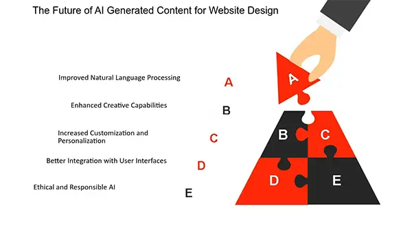
AI-Generated Content and Imagery
AI-generated content has gained momentum and popularity across verticals. It has the potential to change every aspect of the website from appearance, and functionality to the user experience and interaction with the visitors.
Integrating Artificial intelligence and generative art in web designing can potentially change the whole digital landscape.
Interactive Storytelling
Storytelling has always been a crucial component of user engagement. Where it can be used for multiple purposes, such as building a unique brand identity in a highly competitive environment.
Here are some of the storytelling strategies you can try to create an unforgettable user experience:
- Understand the story’s protagonist and the purpose of the product.
- Define the structure of your narration.
- Connect the plot with some compelling visuals.
- Add an emotional touch to the story.
- Use metaphors and humor to build a strong bond.
- And of course, make it simple.
Did You Know?
Nearly 8 out of 10 people will bounce if your website’s design is not good enough.
Interactivity and Motion Effects
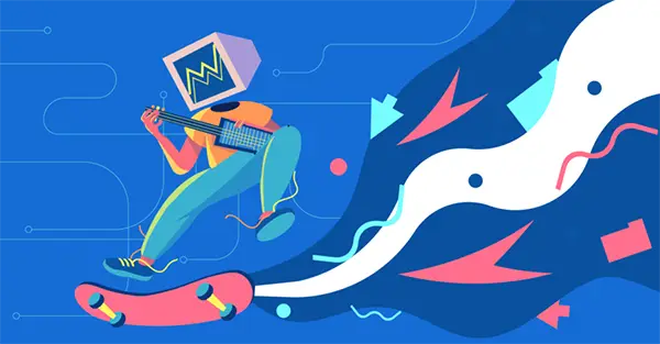
Motion effects are the art of creating strong visuals that can move, transform, and change over time. As it responds to the user’s actions or inputs, it is considered one of the best interactivity tools in web design.
From the micro-interaction to the traditional web designing elements like typography buttons and icons scattered across the website. Interactivity and motion effects enhance the user experience.
Did you know, Forbes also encouraged people to create an interactive website ASAP?
According to them, It drives engagement, keeps attention, and builds a strong relationship with the customer.
Parallax Scrolling
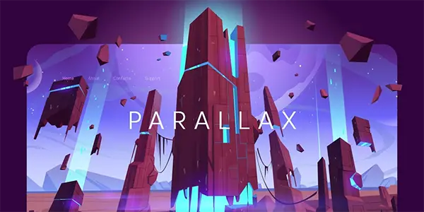
Parallax effects can make a flat pixel come to life with a sense of dimensionality. This not only creates a depth illusion but also adds a 3D effect while scrolling.
The websites designed with parallax scrolling look more fun and professional, where the background of the website moves at a slower pace than the foreground.
But how do we know that it is going to stay with us this year too?
Well, because it goes perfectly with all kinds of animation and can easily rejuvenate the boring structure of your website.
Typography Madness
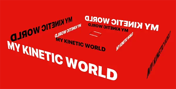
Typography is an all-time proven way to speak directly with your public, and an aesthetic way to make the message epic.
Following are the best tips in typography in web designs:
- Choose minimum but aesthetically pleasing fonts that resonate with your website.
- Avoid using all caps.
- Don’t minimize the spacing between lines
- Deploy an appropriate color contraction.
- And use formatting for a pleasant reading experience.
Do You Know?
90% of internet searches are done on mobile, which is why creating a mobile-friendly website is a crucial component of perfect web designing.
Y2K
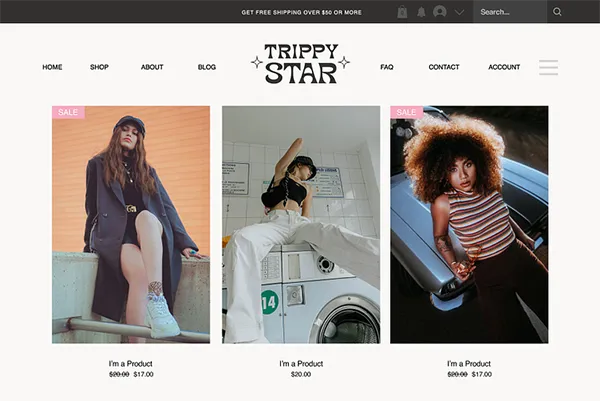
Nostalgia is back with a bang! According to some studies, people are more nostalgic than ever, and even Gen Z’s feel for the simpler times and comfort.
As we are witnessing Y2K fashion, songs and movies are at the top of the list, multiple websites have started integrating retro vibes in their design.
The Y2k aesthetic graphics include the use of glittery effects and metallic and bold colors with a perfect blend of pop culture references.
This retro fusion is an ultra-modern feature that strikes directly at the heart of the user experience. Especially when combined with some futuristic elements.
Bottom Line
In the end, I would just like to point out some of the words of Gabi Robins, who is a brand designer at Webflow. He Says:
“Trends are important to be aware of, but don’t let them dictate what you’re doing.
Trends cycle so quickly that it can be impossible to keep up, but that also means everything could be trendy at some point.”
So just take these trends as an inspiration because you already know what works best for your audience and what will work best if you try it. Hope it helps.
Thanks for reading!
