Icons8 provides IT development teams with visual assets for different processes and permits considerable customization that aids in simplifying design workflows.
Icons become inconsistent when they are of different styles within a singular application or website, which may lower the quality of branding of a product.
The gap in design tools and where development work is done usually presents some points of friction.
A well-composed set of an icon system saves navigation and thinking time, and at the same time, an undue burden is lifted from designers.
Are you struggling to find quality icons that align best with the applications or websites you are working on? Icons8 is the solution you need.
There are more than thousands of designers and developers who have chosen Icons8 (Source: blog.icons8).
Because it streamlines the design process, gives high-quality visual assets, as well as provides flexibility for customization to the IT developers.
What makes it stand out from other options is that it solves specific technical headaches that plague development workflows.
You may now take a look at this blog to understand more about this subject and how it is valuable for the IT development teams.
The Problem with Icon Inconsistency
You may have noticed that when icons don’t align with the application or website, it starts to appear unprofessional.
That not only can create confusion and reduce usability, but also can be devastating to the user experience.
Let me give you an example.
There was one project I worked on that had 47 different “user” icons, and that was scattered throughout the codebase.
And each one was added by a different developer who couldn’t find the “official” version.
And you know what the result was? A jarring interface where users subconsciously felt something was off but couldn’t quite identify why.
Thankfully, Icons8 tackled this problem and structured 1.42 million icons into 47 style families.
When a development team needs a calendar icon that matches their existing navigation set, they don’t have to create one from scratch.
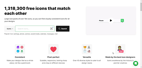
The image below demonstrates the icons8 overview.
Nuts and Bolts: The Technical Stuff That Matters
From the developer’s perspective says that the several aspects of Icons8 assets can make integration substantially easier:
Clean SVG Code
I once worked with sets of icons in which opening the SVG file was a pandemonium of excess groups, nonsensical IDs, and even redundant design residues.
Icons8 SVGs are clean, and they contain optimized paths without the cruft, and this matters when you’re embedding icons directly in component libraries.
<!!– Clean SVG structure makes code manipulation easier –>
When writing code programmatically, using icon-predictive filenames becomes necessary.
Icons8 uses naming conventions like home-24.svg or user-account-48.svg that make automation much simpler.
Format Flexibility
Sometimes SVG isn’t the correct answer, therefore, Icons8 provides PNG, SVG, PDF, EPS, PSD, and AI formats off the shelf.
When backend developers are producing PDFs, they may use vector versions, while frontend developers creating highly detailed animations will likely want SVG.
API Integration
The API option enables you to fetch icons programmatically rather than embedding them all in your codebase, particularly when it’s about huge applications.
This can significantly reduce application size, especially for feature-rich enterprise software where only a subset of icons appear for each user.
Real-World Implementation Patterns
Another thing to bear in mind is that different development teams approach icon integration differently.
Here are patterns I’ve seen work well:
SVG Sprite Approach
Many front-end teams combine icons into SVG sprites to reduce HTTP requests:
This abstraction ensures consistent sizing, coloring, and accessibility throughout the application. Icons8’s consistent path structures make this implementation simpler.
Font Icon Implementation
Some teams still prefer icon fonts for their simplicity:
@font-face {
font-family: ‘MyIcons’;
src: url(‘myicons.woff2’) format(‘woff2’);
}
.icon::before {
font-family: ‘MyIcons’;
display: inline-block;
}
.icon-home::before { content: ‘\e900’; }
.icon-settings::before { content: ‘\e901’; }
While SVG offers more flexibility, icon fonts work well for simpler interfaces where color changes are infrequent.
Specific Use Cases Across Technical Teams
Icons don’t function similarly for everyone, they serve different purposes for different IT roles:
Front-End Development
For UI developers, readily available common interface elements like the house icon mean less time spent creating assets and more time building functionality.
A standard navigation component can often utilize 5-10 icons for basic actions or changes.
Pre-made sets of icons that are uniform with the desired style can be used to streamline development, and these dramatically save development time.
The front-end teams especially value this capability during the subsequent phases of work to add new features when additional interface elements are needed.
This consistency prevents the gradual visual drift when designers create one-off icons for each new feature.
UX Engineering Teams
Focus for UX engineers centers around component systems instead of single screens.
Icons8’s style families support this systematic approach, providing consistent visual languages across component libraries.
When building design systems, UX engineers often create icon components that enforce consistent sizing, coloring, and accessibility patterns.
Clear and consistent structures of SVG files allow the team to work straightforwardly.
Backend Development
Even backend-focused teams need icons for administrative interfaces, documentation, and monitoring dashboards.
Server conditions, health of the database, and network availability become easier to grasp with diagrammatic representations bordering upon clear, uniform pictograms.
Backend developers typically have less design expertise, making pre-built icons particularly valuable for internal tools and administrative interfaces.
Technical Implementation Challenges
Implementing icon systems comes with several technical considerations:
Accessibility Requirements
Icons without text labels create accessibility barriers unless properly implemented:
<!– Bad: Icon with no accessible name –>
<button><svg>…</svg></button>
<!– Better: Icon with accessible name –>
<button aria-label=”Home”>
<svg aria-hidden=”true”>…</svg>
</button>
<!– Best: Icon with visible label –>
<button>
<svg aria-hidden=”true”>…</svg>
<span>Home</span>
</button>
Common accessibility patterns include:
Adding aria-label attributes to icon-only interactive elements
Using aria-hidden=”true” on decorative icons
Including visible text labels whenever possible
Ensuring sufficient color contrast for icons carrying meaning
Performance Considerations
Icon rendering impacts performance, particularly on resource-constrained devices:
Payload Size: The libraries with large icons can add significant weight to applications.
Rendering Complexity: Complex SVG paths generally require more CPU processing.
Memory Usage: SVG elements in large numbers can lead to an increase in the DOM size.
Layout Shifts: Asynchronously loaded icons can cause layout instability
Mitigation strategies include:
You can use sprites or symbol systems to reduce HTTP requests.
Implementing code-splitting can assist you in loading icons on demand.
Optimizing SVG paths can help reduce the complexity.
Setting explicit dimensions to prevent layout shifts
Browser Compatibility
SVG support is generally good in modern browsers, but implementation details can vary:
IE11: It requires special handling for SVG sprites.
Mobile Browsers: This may have performance issues with complex SVGs.
SVG2 Features: Newer SVG features have inconsistent support.
Practical Integration With Development Workflows
Effective icon systems integrate with development processes:
Design-to-Development Handoff
The gap between design tools and development environments can often cause friction.
Designers work with tools like Figma or Sketch; however, on the other hand, developers need optimized assets for implementation.
Icons8 bridges this gap with plugins for design tools and optimized assets for development, and reduces the typical back-and-forth between teams.
Version Control Strategies
Icon assets should follow the same version control practices as code:
Tracking Changes: You can commit icon assets alongside the code that uses them.
Avoiding Duplication: You can use a centralized icon system to prevent duplicates.
Managing Updates: Handle icon changes through the same review processes as code changes
Build Process Integration
Modern build systems optimize icons during the build process:
//webpack. Config. JS example
module.exports = {
// …
module: {
rules: [
{
test: /\.svg$/,
use: [
{
loader: ‘svgo-loader’,
options: {
plugins: [
{ removeViewBox: false },
{ cleanupIDs: false }
]
}
}
]
}
]
}
};
This ensures icons are optimized before deployment without manual intervention.
Measurable Benefits
Teams implementing systematic icon approaches report several concrete benefits:
Development Velocity
The time you spend on creating or hunting for assets can be reduced or eliminated with pre-built, consistent icons.
One team I worked with estimated they saved 3-4 hours per feature by having a comprehensive icon system.
Interface Consistency
Usability testing shows that consistent iconography improves task completion rates and reduces errors.
Reduced Technical Debt
When icons are implemented systematically, updates require changing a single source rather than hunting down every instance.
This becomes particularly valuable when refreshing an application’s design you are working on.
When to Consider Alternative Approaches
Another pivotal aspect to keep in mind is that no tool fits every situation perfectly; there are cases where Icons8 might not be the right choice:
Highly Custom Interfaces
If you have a product with entirely bespoke visual languages, then you might need custom-crafted icons.
Offline-First Applications
Applications that must function entirely offline might prefer embedding custom icon sets rather than relying on API access.
Extremely Performance-Critical Contexts
A minimal custom icon set might be more appropriate for applications where every kilobyte matters.
Technical Implementation Tips
Based on experience implementing icon systems across multiple projects:
Define Usage Patterns: You can establish standard patterns for icon implementation in your codebase.
Create Abstractions: Can build components or functions that handle icon rendering consistently.
Document the System: Make sure to ensure that all team members understand how to use icons properly.
Optimize Appropriately: You can prefer utilizing build tools to optimize icons automatically.
Test Across Devices: Verify that icons render correctly across all supported browsers and devices.
Final Thoughts on Icon Systems
Although icons appear trivial in mobile application development, their use can either positively or negatively impact user experience and development workflows.
An icon system that is well organized lowers visual strain for users while reducing wasteful effort for developers.
Due to the integration of development workflows within Icons8, various issues related to workflow elements have been amply covered.
Teams can create more consistent, maintainable, practical applications by treating icons as a system rather than individual assets.
The most compelling evidence comes from development teams who systematically implement icon libraries.
They ship faster, maintain consistent interfaces, as well as create better user experiences.
These benefits make icon systems a design consideration and a fundamental component of technical architecture.
FAQs
Ans: Icons8 streamlines the design process, gives high-quality visual assets, as well as provides flexibility for customization.
Ans: Icon inconsistency can create confusion, reduce usability, and can also damage brand credibility, which can harm the user experience.
Ans: Yes, Icons8 offers a free tier for its icons, illustrations, and other design resources.
