Many businesses believe that their landing pages automatically generate conversions just because they exist. If you are also one of them, don’t miss the actual scenario behind it. An uninspired text of one percent serves as a lead that significantly hinders potential gains.
The landing pages certainly possess the capacity to capture conversions, outperforming even when website home pages are properly optimized, their full potential remains and is tapped due to common errors.
The industrial data underscores this, let’s take an example of WordStream research, suggesting the average landing page conversion rate across industries stages around 2.35%, and top performers achieve rates exceeding 5.31% or even higher.
These numbers highlight the opportunity for improvement using strategies to optimize the landing page and turn every visitor into a valuable lead or customer, and get about 3x conversion rates.
Still confused about how to do so? Stay on this page and read the whole article to learn about the top five landing page optimization mistakes and how to fix them.
KEY TAKEAWAYS
- Optimized landing pages surpass homepages due to their singular focus, boosting conversion rates significantly.
- Small conversion rate gains lead to substantial increases in marketing ROI and revenue.
- Avoid Clutter: Too much information or navigation overwhelms visitors. Simplify design, remove distractions, and keep your message clear.
- Neglecting mobile users means lost conversions. Design for small screens first, ensuring speed and simplicity.
- Optimize Forms & CTAs: Generic forms and vague buttons deter action. Make forms short, CTAs specific, and buttons visually prominent.
- Focus on a seamless user journey to build trust and improve conversion.
- Consider specialists for optimal results, avoiding costly trial and error.
The most frequent landing page design and development sin that we all have done. Overloading the landing page with too much information, different buttons, or navigation menus.
What occurs when visitors land on a cluttered page that’s attempting to do too much at once. Their first instinct is to leave as soon as possible. Also, they leave without taking any action. What happened?
We add on more buttons, more text, more options, more of everything in an attempt to increase conversion. “Surely,” we believe, “if we give people more choices, more will choose something,” however, the opposite occurs. Analysis paralysis occurs, and visitors click the back button rather than your call-to-action (CTA).
Mobile devices currently account for more than 63% of website traffic. Yet, too many landing pages still continue to be overlooked by mobile users. Frustrated users are pinching, zooming, and bouncing before they even notice your offer.
As per Unbounce, 83% of landing page visits occur on mobile, but mobile conversion rates are still 8% lower than those on desktops. It could be a gap that costs millions of lost conversions each year.
Now let’s turn our focus on the silent deal-breakers coming to your landing page optimization. Take a look at the lead capture form as well as the call-to-action (CTA) button. They serve as the starting point for your conversions. Yet, they get neglected too often. So, here are some areas to show concern:
A boring “Submit” button, a form with too many fields, or worse, a CTA that disappears into the background like camouflage.
A form that asks for too many details or a CTA that’s vague (“Click Here!”) can cause your conversion rate to suffer a lot. You are practically inviting them to bounce, in case the CTA is misaligned with the visitor’s intent or stage in the journey. Additionally, keep in mind that if the CTA doesn’t make people feel as though they need to act now, they probably won’t.
It makes sense that visitors ignore them, lose interest, or abandon your page before they have ever gotten their information.
INTERESTING FACT
“Elements like prominent security badges, clear privacy policy links, or even the authenticity of testimonials—though often overlooked in design—can subconsciously boost a visitor’s confidence and willingness to convert, even before they fully process the offer.”
In the conclusion, landing page optimization is building a user experience that doesn’t waste your visitors’ time while guiding them towards a decision that works for everyone involved.
Think about what your customers require by taking a step back. Cut out what gets in their way, and keep your eye on their entire journey. In addition to increasing your conversion rates, you will build trust and polish your user experience.
You see, designing and developing landing pages is not like a walk in the park. It’s quite feeling uncertain about pulling it all together effectively, that’s completely normal. A lot of smart business owners realize they get better outcomes when they team up with professional landing page development services.
The right experts, like Email Mavlers contribute more than just design skills. They understand UX principles, persuasion psychology, and the simple factors that make visitors rely on you enough to convert. They’ve observed what works across industries and can help you avoid the expensive trial-and-error stage that eats into your marketing budget.
Whether you optimize landing pages yourself or work with conversion specialists, the query doesn’t refer to affordability to optimize your landing pages properly–it means you can afford not to.
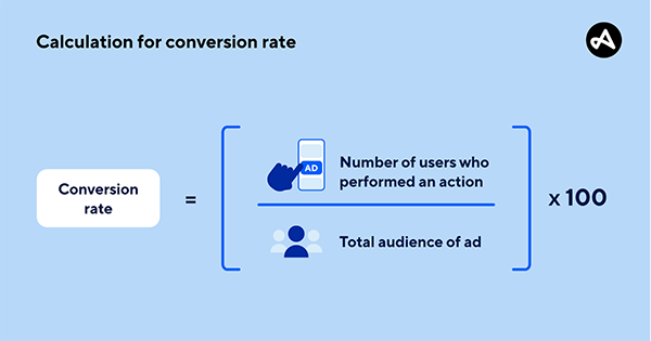
Besides everything, here is how you can calculate conversion rates on your website to work on the mistakes effectively.
Ans: CLanding pages are more effective for conversions due to their single, clear focus, eliminating distractions.
Ans: It’s a quick way to check for visual clutter: squint at your page; if multiple elements compete for attention, simplify it.
Ans: Most web traffic comes from mobile; ignoring it frustrates users and drastically cuts conversions.
Ans: They’re vague. Use specific CTAs that highlight value, like “Get My Free Template,” to encourage action.
Ans: Your landing page should have only one clear objective. All elements should guide visitors towards that single conversion goal.