Did you know? As of 2024, jQuery is used by a significant portion of websites. It is estimated that jQuery is used by over 70% of all websites and over 90% of websites that use a known JavaScript library. (source)
Today, technology and advanced frameworks are moving at a rapid pace, where every company is working to foster an optimized user experience on their platform.
Website development has become one of the most demanding services around the globe in the post-pandemic era.
Different design architectures are evolving day by day to produce optimum quality outputs in short periods.
Although modern JavaScript frameworks capture most attention today, jQuery stands strong as a dominant force within responsive web design. But how so? And what makes it so special?
Well, this blog post aims to answer these types of questions thoroughly, giving valuable insights to the readers.
Let’s begin!
Key Takeaways
Understanding what makes jQuery Perfect for Responsive Design
Decoding the Core jQuery Features That Enhance Responsiveness
Distinguishing a comparison between jQuery vs. Modern Frameworks for Responsive Projects
Real-World Responsive Design Patterns with jQuery
When to Hire a jQuery Expert for Your Project
What Makes jQuery Perfect for Responsive Design
Although it may seem antiquated, jQuery continues to enjoy widespread popularity, with approximately 90.8% of websites utilizing a recognized JavaScript library still incorporating it, as indicated by recent statistics.
The enduring relevance of jQuery in contemporary web development can be attributed to its practical utility rather than mere longevity. jQuery exemplifies sophistication through its user-friendly design. A minimal amount of code using jQuery enables developers to create complex responsive functionalities that would typically require extensive JavaScript knowledge.
The following points explain why jQuery continues to function as a leading tool for responsive design.
jQuery automatically resolves browser differences to ensure responsive elements function uniformly across every browser.
jQuery enables you to create efficient responsive adjustments with minimal code.
The jQuery framework facilitates the efficient handling of touch, click, and resize events essential for responsive interactions.
Create smooth transitions across different viewport states.
When you need to hire jQuery developers, you’re not just getting someone who knows an old library – you’re getting expertise in one of the most battle-tested tools for ensuring your site responds perfectly across devices.
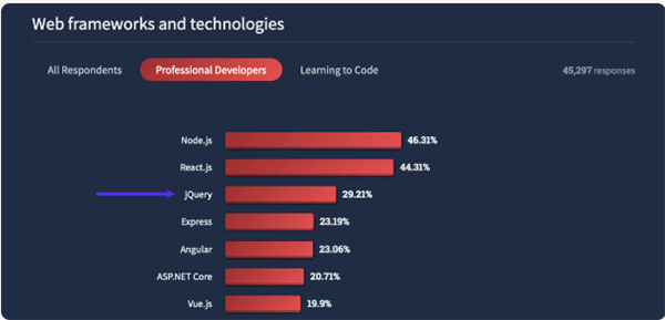
Intriguing Insights This infographic shows the most used web frameworks, and jQuery ranks third among them.
Core jQuery Features That Enhance Responsiveness
Several built-in jQuery features exist to streamline and optimize responsive web design processes.
1. Viewport Detection and Response
jQuery lets you quickly find out the size of the viewport and change your layouts on the fly with very little code. Using screen size information in jQuery allows you to hide elements or alter classes and completely restructure your page layout with ease.
2. Dynamic Content Loading
Responsive websites must deliver appropriate content at precise moments to function effectively. With jQuery, developers can load optimized content that changes based on device type, like mobile devices with smaller files and desktops with full content. This improves performance and the user experience.
3. Touch Event Handling
Mobile responsiveness requires simplified touch event management, which jQuery provides. Because it’s easy to detect swipes, taps, and other touch interactions, developers can make mobile-friendly interfaces faster.
The widespread adoption of jQuery across more than 69 million live websites globally demonstrates its utility, including approximately 5.4 million sites hosted in the United States. Responsive behaviors become incredibly simple to implement when compared to other methods.
jQuery vs. Modern Frameworks for Responsive Projects
With modern frameworks like React, Vue, and Angular available, developers might wonder why jQuery remains a choice for responsive design. The solution to this question is less complex than you would assume.
When jQuery Wins for Responsive Design:
jQuery necessitates a modest learning commitment for fundamental responsive functionalities on uncomplicated websites.
jQuery offers smooth integration options for legacy systems that need responsive enhancements.
As of March 2025, over 14.5 million websites in the United States utilize jQuery plugin technologies.
Basic responsive websites can be developed with less total code when using jQuery instead of a modern framework.
When Modern Frameworks Might Be Better:
Complex single-page applications, projects requiring extensive state management.
The project team has existing expertise with specific modern frameworks. Project scope determines the final decision. Choosing jQuery developers for responsive design represents a practical decision to combine established technology with current development requirements.
Interesting Facts While jQuery’s overall usage is high, its presence among the very top websites is less dominant. As of mid-2024, it’s used by 54.7% of the top 10,000 websites. (Source)
Real-World Responsive Design Patterns with jQuery
We will explore some practical patterns for responsive design that jQuery simplifies for developers.
Responsive Navigation Transformation
A full-width horizontal navigation menu is often turned into a hamburger menu when viewed on a mobile device. Using jQuery makes it simple to control menu visibility while changing navigation functionality according to screen size.
Conditional Loading for Different Devices
jQuery provides a straightforward solution to serve varying content depending on device capabilities. Minimal code can be employed to deliver optimized image sizes for mobile bandwidth savings and adjust layouts following screen dimensions.
Responsive Layout Adjustments
jQuery enables layout rearrangement according to variations in screen size. Do you need to position the sidebar below the main content when viewing on mobile screens? You can use jQuery to modify a four-column grid layout to display only two columns. jQuery enables direct DOM adjustments without needing advanced CSS media queries. The ease of implementation and strong impact of these patterns explain the ongoing relevance of jQuery in responsive design.
When to Hire jQuery Expertise for Your Project
Although jQuery isn’t required for every project, many projects find it to be very helpful when they use it. Responsive projects require jQuery developers during specific scenarios like legacy site modernization and quick-launch situations.
Perfect Scenarios for jQuery Experts:
Legacy Site Modernization: You can make existing websites responsive by updating them without a complete rebuild.
Quick-Launch Projects: jQuery expertise helps you launch responsive websites in a short time frame.
Cross-Browser Compatibility: jQuery becomes essential when you require dependable website functionality across different browsers.
Its straightforward approach makes jQuery the go-to solution for both new startups and established companies that need lightweight options.
How jQuery Enhances Development Workflow
A benefit of jQuery that is often overlooked is its ability to speed up development.
1. Rapid Prototyping
Developers can rapidly prototype responsive behaviors using jQuery’s compact syntax before moving to final implementations.
2. Simplified Debugging
It’s much easier to fix problems with responsive development when you use jQuery’s chainable methods. Tracking down device-specific bugs requires minimal effort with jQuery.
3. Incremental Enhancement
jQuery effectively improves websites with responsive enhancements while maintaining their essential functions.
Wrapping It All Up
The emergence of new frameworks has not devalued jQuery’s status as a powerful resource for responsive web design. Because jQuery is easy to use, has a large community of plugins, and works in all browsers, it is a great choice for many responsive projects.
For updating legacy sites or starting new projects while requiring dependable cross-browser support, jQuery provides a solution. As of 2025, jQuery remains a practical tool for responsive design due to its extensive community support and straightforward syntax.
When selecting jQuery developers for complex projects, you should find professionals who possess expertise in jQuery capabilities alongside modern responsive design principles. A skilled developer will effectively use jQuery’s features to address your particular responsive design requirements.
Frequently Asked Questions
Ans: jQuery simplifies the HTML markup, document traversal, event handling, animating, and AJAX interactions for rapid web development
Ans: jQuery is a fast, small, and feature-rich JavaScript library. It makes things like HTML document traversal and manipulation, event handling, animation, and Ajax
Ans: Despite being lightweight, jQuery’s library is massive. As the code base keeps growing, it takes longer to open the JS file, which puts an additional strain on the user’s computer.
